Thursday, October 18, 2012

Visual Hierarchy


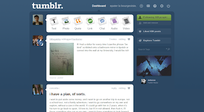
Dashboard by Tumblr

Tumblr's dashboard is essentially the motherboard for all tumblr users and provides them with the tools necessary to get the most out of their blogging experience. With tumblr, you have the ability to create blog posts with text, music, videos, pictures, etc. Immediately your eye is drawn to their symbols at the top of the page which are all highlighted by a white text box over the dark blue of the rest of the page. The posts by the other tumblr blogs you follow are also highlighted this way for easy visibility. Along with their own distinct symbol, each post possibility is a different color, such as quotes being orange and links being green, to help the user easily distinct between each one. At the top of the screen are a variety of other symbols that help the user manage their tumblr:  an envelope for the message inbox, a gear for settings and configuration, a question mark for help, etc. To the left of the screen highlighted in bright green is the number of other blogs you follow and that follow you so that you are always in the know of how popular your blog is. More symbols are used on this side of the screen as well: your liked posts are symbolized by a little heart and the search box has a small microscope. I feel that tumblr has found a unique and creative way to show visual hierarchy through the use of symbols. These symbols are both clever in their design and useful in their purpose to guide the users eye to the tools they will need to run a successful blog.
Thursday, October 11, 2012

Visual Perception 1 / Top-Down Processing


 Lego 3-in-1 Creator House by Lego

 An example of top-down visual processing in visual design is the packaging for Lego toy sets and their enclosed instruction manuals. The front design for a Lego set usually displays the finished product after all the the individual pieces have been put together. This particular Lego box shows 3 possible ways for the pieces to be constructed, providing 3 possible goals to be achieved and 3 different incentives for the consumer to purchase this product. It isn't until they open the box and find all the individual pieces inside does the work and attention to detail commence. The consumer must look ahead at the final result to understand how all the details, in this case individual Lego pieces, all work together to create the finished house. The included manual helps the consumer understand how to construct all the small pieces together to make the bigger picture a reality and ultimately achieve their desired goal. 

Thursday, October 4, 2012

Design Success and Failure


Design Event Poster 

Success:

The syntactical guidelines have been put to good use. The grouping of the text establishes a hierarchy of type according to the most important information on the poster such as the event name and date. The text and the image is aligned to the left of the page which balances the overall composition of the piece.


Rave Flyer

Failure: 

Some of the type is grouped and aligned but then followed by other groups of text arbitrarily placed throughout the flyer. There is little to no variation in type size, therefore failing to establish a hierarchy of type or information. The "Everything Must Glow" warped type further throws of the lack of alignment and adds to the imbalance of the whole piece.