Thursday, December 20, 2012

Visual Techniques


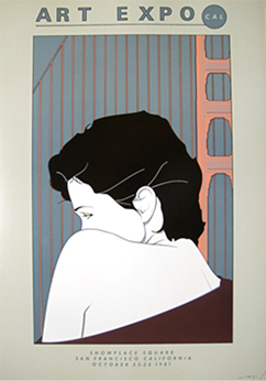
San Francisco Art Expo 1981 by Patrick Nagel 


Asymmetry, Contrast, Simplicity, Flatness, Stasis


Harper's Bazaar cover by Erte 

Contrast, Asymmetry, Activeness, Flatness

Both poster designs employ the visual technique of asymmetry. Patrick Nagel's poster for the 1981 SF Art Expo uses the technique to asymmetrically portray the golden gate bridge behind one of his signature women. Erte uses asymmetry to create a contrast between the models on the right and woman's face on the left. He also uses contrasting colors to highlight the red carpet, the gold of the curtains, the blue of the models makeup and the white of the skin and gowns of the models. Nagel also uses the same contrasting colors to highlight the red of the golden gate bridge and the pale white skin of his model. Both artists also use bold lines to emphasis the flatness of their subjects and backgounds. This is an element found in both of these artists' signature styles and shows off their influence from the bold lines and bold colors found in Japanese woodblock prints. While Erte's piece suggests activeness with the posing and placement of his models on a runway, Nagel's pieces uses stasis to emphasize the calm, romantic feel of his model and the golden gate bridge behind her. 

Thursday, December 13, 2012

Contrast


iPod advertisement by Apple 

The early advertisements for the Apple iPod featured a successful and appealing way of using contrast in advertisement design. They all featured a dark silhouette of a dancer, a white apple iPod in his or her hand, against a contrasting colored background. The white of the iPod, signature white ear buds, and the white iPod logo all draw the viewers attention and make them immediately aware of the product that is advertised. The dancer silhouette provides a nice contrast and graphic image to go with the white iPod and the colored background. Other similar advertisements feature the dancer against a more psychedelic background, providing a visual metaphor for the sensation of listening to music. The faceless dancer allows the viewer to more easily imagine themselves as the dancer. The image and contrast along with the effectiveness of the simple "iPod" text all work together so nicely that no other text, slogan or product description is needed. This advertisement design by Apple is both simple yet memorable and brings to mind the simple and memorable designs of most apple products.


Shape-ups ad by Sketchers

The contrast in this ad for Sketchers "Shape-ups" shoes fails almost as much as their shoes fail to help a person lose weight. First, the contrast in the text sizes adds little to no visual hierarchy to the text. The text of the body paragraph is almost the same size as the text of the header adding little contrast and little attraction for the viewers eyes. The lack of difference in fonts does not help the situation either. The some of the white text is outlined with a purple border which actually makes the words blend in more with the purple background rather than stand out against it. The completely white bodies of text have no luck either and are almost completely unreadable, drowning in the intensity of the purple background. Also the lack in different font styles used does not establish a visual hierarchy either. All the text looks roughly the same adding little variety and little interesting features to this ad. 

Thursday, December 6, 2012

Movement/Motion

The Avengers movie poster by Marvel

The implied motion used in movie poster advertisements is most effective when advertising action/adventure movies. The poster for the film The Avengers is filled to the brim with implied motion . The poster portrays all the films main characters during the epic battle that takes place during the movie's climax. Each superhero is caught doing a heroic stance, ready for action. Others, mainly The Hulk and Iron Man, look as if they are about to attack an off screen enemy. The backdrop of the heroes also contains implied motion. They stand in the center of New York city which is under attack as buildings crumble or catch on fire in the background. Spaceships spin out of control and fireballs fall from the sky to further portray the destruction. Even the circle surrounding the "A" in "Avengers" logo is implying a circular motion, bringing to mind the group leader Captain America's spinning shield attack .


New Super Mario Bros. U game cover by Nintendo

The game cover art for New Super Mario Bros. U uses implied motion to advertise the game play of the new Wii U game. The characters are all facing to the right which is the traditional direction that side scroller video games such as Super Mario Bros. follow. The characters are also all shown floating in the air, since jumping on your enemies is the main power in Super Mario games. Other new flying abilities are also portrayed such as using the raccoon suit to glide through the air. Mario's friends the Yoshis appear in this game as well. They are also portrayed floating in the air and shown using their new abilities for the game such as flying and using bubbles to defeat enemies. The text of the game's title is given a three dimensional feel as if it were bursting out of the box at the reader, further emphasizing the three dimensional look and feel of the game. The word "new" is enclosed in an action bubble, most often scene during action scenes in comics and bringing to mind the intense movement during those action scenes. 

Thursday, November 29, 2012

Dimension/Dept/Space/Scale


Adventure Time Opening Title Sequence by Cartoon Network


The opening sequence for the Cartoon Network show Adventure Time features an entire virtual tour of the shows landscape and main characters and villains, all in a matter of 25 seconds. This is achieved by the overlapping of different images which are then zoomed in upon and zoomed past, giving an illusion of depth to the otherwise two dimensional world.  The camera follows a flow pattern throughout the landscape and provides the viewer a first person perspective throughout the sequence. This gives the viewer the feeling that they are flying throughout the land of "Ooo" and gives a sense of scale as to how big this imaginary 2D world would be if it were real.
 The sequence begins with the camera view coming out of a cave, then zooming past several different places including a junkyard, mountains, and a castle.  Each next destination is seen in the background of the previous one, which keeps the motion flowing. The sequence ends with the camera zooming into the window of a tree house to revels the shows main heroes inside.  This gives you a feel for the depth and size of the 2D world that the characters live in and travel across in the show.

Friday, November 16, 2012

Tone and Color


Baby I'm Yours (Official Music Video) by Breakbot


How TONE is operating

The tone in this music video is used to draw the viewers eye to the areas of light against the dark black background.  The background of the entire video is dark which creates a nice contrast with the bright colors of the imagery seen in the video. This demands that the viewers attention be entirely on the areas of light and color which create shapes and portray motion along to the beat of the song.


How TONE is interacting

Tone is interacting with line in this video to create shapes and images against an otherwise dark background. The contrast between the color against the black background creates lines which give the illusion of different shapes.These lines vary from thin to bold to give the illusion of depth as well.


How COLOR is operating

Color is the main creative element in this music video. It creates a beautiful aesthetic experience to accompany the uplifting, dance beat of the song. The colors are bright, psychodelic, and give life to the funky lyrics and bass line of the song. 


How COLOR is interacting

Color is used in the video to create a variety of different objects and shapes. The shapes range from people to instruments to animals, each with their own beautiful variety of colors. The video contains a  kaleidoscope of colors and visuals which provides the viewer with an intense and beautiful aesthetic experience.


Thursday, November 8, 2012

Magazine Design


Esquire Magazine 

Shape

The Square in this article establishes visual hierarchy by drawing your eye to the orange squares that house the title of each article. It establishes itself as the dominant aspect of the entire piece with the text and pictures being in square shapes as well. The bright orange squares against the dull white of the background and plain black of the text captures the viewers eye and shows them where each column begins. The pictures on the pages are also square shaped and in black and white as to not draw attention from the bright orange squares. The text is even arranged in square paragraphs as to keep with the shape theme. The overall theme of this piece is minimalist in both color and shape, centering around a square theme. 


Code (x) Magazine 

Line

Line is the essential element to this piece. The lines draw your eye to the title of the article which is surrounded by the diagonals of the sun in the background. It gives a 3D effect to the outline of the shape of the country of Japan. In edition to adding dimension, the lines in this piece also show the direction in which the viewers eye should travel. This is most noticeable in the text of this article which is all diagonally composed as opposed to being horizontal. This particular aspect of the piece is appropriate by further continuing the Japanese theme of the article due to the fact that Japanese characters are usually read horizontally. 


Sashay Magazine 

Scale

The scale of the lettering in this piece establishes a visual hierarchy of type. The main title of the article is made obviously bigger than the text of the subtitles and the body of the article in order to establish this as both the main subject and lettering of the entire piece. The first letter of the body of the article is made bold and huge to draw the readers eye to where they should begin reading. The body of the article is arranged in cascading text column to guide the reader up and down the entire article and page and eventually on to the next page of the magazine. 

Thursday, November 1, 2012

Visual Thinking Research


Cube Ring Puzzle by Puzzles.com

 For this exercise, my mom and I had to identify which of the four shapes was different than the other three. My method of approaching the task, shown in the image on the left, involved looking at the overall shape of the figure. I looked at the image marked "B"and rotated it in my head to see if it would match A, C, and D and discovered that choice "C" was the odd shape out. My mom took a different approach to the task and looked at each shape as being made up of three different smaller shapes. She was then able to notice that the shapes in choice "C" looked different than the shapes in the other three choices.


Block Twins Puzzle by Puzzles.com

This exercise had us identify matching pairs of shapes. My method as shown in the left image was to see each shape as a whole and imagine them from different viewpoints. I looked to see if any of those viewpoints I imagined were similar to an image on the paper to find the matching pairs. My mom's method was to once again see each shape as a collection of three different smaller shapes and rotate them in her mind to discover which ones were matching pairs.

Thursday, October 18, 2012

Visual Hierarchy


Dashboard by Tumblr

Tumblr's dashboard is essentially the motherboard for all tumblr users and provides them with the tools necessary to get the most out of their blogging experience. With tumblr, you have the ability to create blog posts with text, music, videos, pictures, etc. Immediately your eye is drawn to their symbols at the top of the page which are all highlighted by a white text box over the dark blue of the rest of the page. The posts by the other tumblr blogs you follow are also highlighted this way for easy visibility. Along with their own distinct symbol, each post possibility is a different color, such as quotes being orange and links being green, to help the user easily distinct between each one. At the top of the screen are a variety of other symbols that help the user manage their tumblr:  an envelope for the message inbox, a gear for settings and configuration, a question mark for help, etc. To the left of the screen highlighted in bright green is the number of other blogs you follow and that follow you so that you are always in the know of how popular your blog is. More symbols are used on this side of the screen as well: your liked posts are symbolized by a little heart and the search box has a small microscope. I feel that tumblr has found a unique and creative way to show visual hierarchy through the use of symbols. These symbols are both clever in their design and useful in their purpose to guide the users eye to the tools they will need to run a successful blog.

Thursday, October 11, 2012

Visual Perception 1 / Top-Down Processing


 Lego 3-in-1 Creator House by Lego

 An example of top-down visual processing in visual design is the packaging for Lego toy sets and their enclosed instruction manuals. The front design for a Lego set usually displays the finished product after all the the individual pieces have been put together. This particular Lego box shows 3 possible ways for the pieces to be constructed, providing 3 possible goals to be achieved and 3 different incentives for the consumer to purchase this product. It isn't until they open the box and find all the individual pieces inside does the work and attention to detail commence. The consumer must look ahead at the final result to understand how all the details, in this case individual Lego pieces, all work together to create the finished house. The included manual helps the consumer understand how to construct all the small pieces together to make the bigger picture a reality and ultimately achieve their desired goal. 

Thursday, October 4, 2012

Design Success and Failure


Design Event Poster 

Success:

The syntactical guidelines have been put to good use. The grouping of the text establishes a hierarchy of type according to the most important information on the poster such as the event name and date. The text and the image is aligned to the left of the page which balances the overall composition of the piece.


Rave Flyer

Failure: 

Some of the type is grouped and aligned but then followed by other groups of text arbitrarily placed throughout the flyer. There is little to no variation in type size, therefore failing to establish a hierarchy of type or information. The "Everything Must Glow" warped type further throws of the lack of alignment and adds to the imbalance of the whole piece.

Thursday, September 27, 2012

Visual vs. Symbolic Language: Economy


 Visuals:
On the edge of a cliff, a group of five people, both male and female, pull on a rope attached to a giant dollar sign. They attempt desperately, a look of strain on their bodies, as they pull to keep the money sign from falling off the cliff. The sun shines brightly behind them, transforming them, the cliff, and the dollar sign into silhouettes.

Responses/ Feelings:
Worry
Concern
Anxiety
Nervousness
Hope

Symbols:
Dollar sign = money
People = citizens of the United States
Cliff = economy's dangerous situation
Rope = struggle with the nations economy 
Sun = hope

The underlying compositional structure of this piece only enhances the responses and feelings experienced by the viewer. The struggle between the people and money sign on the edge of a cliff creates nervousness and concern in the viewer. The bright shining sun in the background arouses hope as if conveying a light at the end of the dark tunnel that is the country's recent struggle with the economy.


Thursday, September 20, 2012

3 Levels of Meaning in Visual Communication Design


Ladyhawke is a pop rock singer-songwriter from New Zealand. She has released two studio albums as well as a special edition version of her first album. All three albums feature cover artwork by Sydney-based illustrator and painter Sarah Larnach. 


Representational
Many albums portray their main singer on the cover but Ladyhawke’s albums take it a step further. The illustrated watercolor artworks represent not just the singer but also the influences and feel of the songs on the album. The bright neon colors and retro gaming systems on the covers represent the 80’s, electronic influence of her songs. Her image represents her style and becomes a symbol seen on all her album and singles covers and gives way to abstractions of her image. All three work together to give a face and identity behind the beautiful melodies and hypnotizing voice heard in Ladyhawke’s songs.

Abstract
            The use of watercolor in the illustrations gives Ladyhawk’s image a dreamlike feel. Her signature messy blonde hair becomes a sea of yellow, brown, and red lines. The neon colors of the watercolor paint highlight her face, hair, and clothes. The backgrounds are all white, as she becomes an oasis of color in an otherwise blank, empty world. Her most recent album “Anxiety” features her with mini versions of her tangled in her hair. These abstractions further represent her image and sound and only enhance the singer’s symbolic status.

Symbolic
            Ladyhawke’s image becomes a recognizable symbol on each album. Her familiar baggy clothes, hypnotizing blue eyes, and tangled mess of long blonde hair become a familiar sight to the viewer. All the tiny women in the last image are easily recognizable as Ladyhawke due to her symbolic look, despite being tangled in her messy hair. Her symbolic status makes way for abstractions that further help to represent Ladyhawke’s signature sound and style. 

Thursday, September 13, 2012

Symbolism


The Triquetra is a three-part interlocking fish symbol that symbolizes the Christian trinity. The word trinity comes from the Latin word "trintas" meaning "three are one." This is reference to the Christian belief that God is one Being made up of three distinct Persons; the Father, Son and Holy Spirit. The use of fish as symbols is also reference to the popular bible passage in which Jesus performs the miracle of feeding hundreds with just a few loaves of bread and fish. The fish has become a popular religious symbol, representing giving and generosity. The fish symbol would be easily recognizable to a practicing Christian and effective in its meaning and message.

Abstraction


The eyes of a character in a Japanese anime are less of an accurate representation and more of an abstraction of a real human eye. The animators usually elongate the iris and pupil of an eye to more of an oval shape rather than a circle.  The highlights and reflections seen on the eyes surface are usually emphasized and enlarged. The eyelids and eyelashes are reduced to bold, angled lines that frames and holds everything together. Also, a character is usually drawn with their eyes taking up at least half of their face, which in turn abstracts the over all representation of a human face. Even with all this abstraction, the viewer is still given enough information and details to recognize this as a human eye.

Representation


The design of a standard corded computer mouse represents the movement and form of that of a real mouse. The design is used for both expressive and functional purposes. The long cord not only allows for use of the device at a comfortable distance from a computer, but also reminds the user of the long tail of a mouse. The clicking sound and scrolling noise also reminds the user of the small noises a real mouse would make while scurrying around at night. The design mostly relies on the viewers own experiences or knowledge of real mice in order to recognize the similarities. There is both usefulness and charm in the design and functionality of the computer mouse.